Weekly RBM Feature: this is a series of articles, where we want to describe some innovative RBM features and our approach in dealing with analysis, presentation, and mitigation of risks in clinical trials.
Last time we took a look at the Risk Flower chart and saw how it could make a lot of information easily presentable in a simple form. However, it is, of course, not without its limitations, which is why for a different task a different approach would be needed. This time let’s explore this anther approach.
While the Risk Flower’s purpose was displaying the ultimately static risk scores and assessments of a Risk Assessment and Categorization draft, today we’ll focus on something more dynamic: the FMEA scores of a study in progress. How should they be presented on the Dashboard of a study? Well, “efficiency” is the name of the game in this case. With that in mind, let’s examine the Risk Overview chart:

In this simplified example you can already see the main features and principles of the chart, the main idea behind it: each risk is represented by a point on the chart (labeled with display names that can be customized to be more descriptive, such as “High toxicity” or just plain identifiers, as the other example), positioned on the Severity and Occurrence scores as the axes. The color-coding shows the boundaries of low, medium and high-risk assessments (in green, yellow and red respectively) with the boundary score values also represented right there.
Of course, all this information (and more!) is available in more detail via a tooltip displayed on hover:

But, of course, the real draw of this chart is its extended functionality. For example, as you can see in the image above, it is possible to “drill down” into any of the Risks presented on the chart to see the scores of the Risk Indicators associated with them. It can be done by just clicking on the point representing the Risk on the chart, but there is also another method:
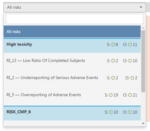
This is the selector element. It is located above the chart and it allows you to pick any Risk or the Key Risk Indicator (KRI) associated with it, as well as check out the Severity and Occurrence scores (represented by the letters “S” and “O” respectively) and the assessment of them (we will explore the icons used to represent the assessments more in a later article).
 Returning to the chart itself, you might have already noticed something interesting with the point markers: they’re different. There is a good reason for that: they show the trend that a Risk or a Key Risk Indicator has been going through as of recent. A diamond means that there was no significant change in the score since the last time it was measured, while an arrow, like in the “High Ration of Lost To Follow-Ups” Risk Indicator here, means that the scores did change. In this case, it shows that while Occurrence of this Risk Indicator remained the same, the Severity dropped.

But, you might be asking, how much did it change? And what about the rest of the history? Can it be seen? Well, you’re in luck, since we are now coming to one of the most important features of this chart.
By clicking on this button, you will navigate to the FMEA Development Dynamic screen:
In here, you can see the Risks (or the Risk Indicators, if you did drill down) as usual, but you also have control of the slider below. By pulling it to the left, you can go back in time and see the positions of the markers change to the scores they had before.
Lastly, there is one more important feature that actually ties together the rest of the charts on the Study Dashboard. By drilling down into a Risk or selecting one of the Risk Indicators, the rest of the charts, like this map chart below, will change to reflect the scores not across the whole study (as they do by default), but of the Risk or Risk Indicator you’ve selected:

To wrap up, let’s briefly take a look at this map chart since it was brought to our attention anyway. It’s much simpler since it serves a much simpler purpose, but it is, of course, also important. This chart shows the distribution of FMEA Score assessments across the regions the study takes place in. It allows for a quick-glance kind of monitoring (as appropriate for a Study Dashboard), and, just as the previous chart we checked out, selecting any country to see the specific sites in a Site-to-Site chart…
But we will take a look at that one in our next article.


